Non-responsive is non-responsive
A philosophy of science blogpost

It’s pretty soon in every philosophy course (or at least epistemology course) that an undergrad comes to a sudden realization: we deal with maps, not territories. Whether it’s through Kant’s idealism, Hume’s skepticism, or just the Wachowskis’ Matrix, it becomes clear to said undergrad that we do not have direct access to the underlying reality, only our representation of it. Everything is perceived: you don’t know what a cat is actually like, you only know how you perceive cats to be.
Like most lessons learned in philosophy, this is striking at the time and then quickly fades into irrelevance. Sure, we might not ever know if the cars zooming by are “really” there or just illusions, but we should probably still look both ways before crossing the street. Science majors, especially, discard these thoughts. This is a pity, because there’s nowhere where acknowledgement of this layer (or layers) of abstraction matter more than science.
Let me give an example from my own life. Bear with me for a second, as this example might seem obscure at first. About a year ago, I was on the Redline subway heading up to Porter Square. I noticed a man slumped over, seemingly overdosed, on the seat across from me. I notified the MBTA authorities through their “see something, say something” app, and an MBTA official came on the train to check on the man.
She shook the overdosed man’s shoulder, but he didn’t wake. She used her walkie talkie to report, “Passenger is non-responsive”. Then she resumed trying to shake him awake. Her colleague, meanwhile, started banging on the metal pole next to the overdosed man.
There was a homeless man also on this train. He was annoyed enough that the train was stopped for this overdosed man (he didn’t know I was responsible for the stopped train, fortunately). But when the woman radioed in “Passenger is non-responsive”, he got very worked up.
“Non-responsive is non-responsive!” the homeless man exclaimed repeatedly. “What’s the use in trying to wake him up? He’s non-responsive!”
Contrary to the homeless man’s protestations, the MBTA officials did manage to wake the overdosed man up. Apparently, using your heavy keys to bang a metal pole right next to your ear cuts through even the heaviest of fentanyl slumps. The no-longer-overdosed man stumbled off the train at the Harvard stop.
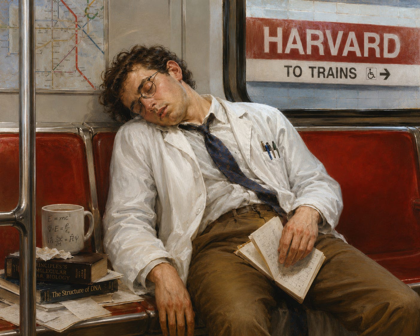
What’s interesting about the reaction of the homeless man is not how strange his logic was. On the contrary, he made a classic logical mistake. He just made it in a very illustrative way. He mistook the map, namely the MBTA woman’s hasty diagnosis of “non-responsive”, for the territory, namely the reality of the man heavily sleeping on the train. Or, to put it more precisely, he insisted on the primacy of the more abstract map, the binary diagnosis of “non-responsive”, over the more detailed and less definitive map of his own perceptions.
I don’t point this out to make fun of him. I point this out because this is an issue all scientists must face, whether we be street scientists on the train or PhDs in a lab. We always deal with abstractions and maps of our data. Generally speaking, we want more detail in our maps over less detail. “I shook the guy’s shoulder and he didn’t wake up” is better than “non-responsive”. And more detail comes with being closer to the territory/data: we can go from “we shook the guy’s shoulder and he didn’t wake up” to “patient does not respond to wake-up attempts”, but not vice versa. Once we boil down to the latter, we sacrifice that detail for certainty.
This general pattern, of details and uncertainty being most prominent at the levels closest to the data holds true everywhere in science. Take GLP 1’s. They work, for sure. But if we dig down into those impressive clinical trial results, here’s what we might find:
Level -1: a participant in the clinical trial taking Zepbound wakes up at 2 am. His stomach hurts like hell for 2 hours, then he vomits.
Level 0: The participant reports his nighttime sickness to the investigator. He simplifies it to “last night I had bad stomach pain and vomited”. In his mind, he’s already compressed the 2 hour gap between the events.
Level 1: The investigator has to put this data into his “map”, which is going to be a spreadsheet of adverse events. He interviews the patient, then puts “pancreatitis” and “likely trial related” into the spreadsheet. Could it have been food poisoning? Maybe, but now it will forever be definitively “likely trial related pancreatitis” in that map.
Level 2: The writer for the clinical trial report has gotten to the safety section. He adds one more to the adverse effects column, and then reports the entire number in the discussion and abstract. “Likely trial related pancreatitis” has become definitively one serious adverse event in this trial.
Level 3: A journalist writes up the trial. He skims the paper and sees there were only a couple serious adverse events, and they were all intestinal. In his article, he writes “Zepbound is very safe. Only 2% of people experienced serious adverse events, and they were all gastrointestinal”. One specific case of pancreatitis has become a rounded figure, packaged as part of a larger narrative that Zepbound is safe.
Level 4: A doctor skims the journalist’s article. He sees that Zepbound is very safe, with only 2% of people experiencing serious adverse events. He tells his overweight patient, “Don’t worry. Almost nobody has any bad effects with Zepbound. It’s very safe”. 2% has become “almost nobody”.
Level 5: When the patient is explaining his prescription to his wife that night, he says, “The doctor says this is super safe and nobody has bad effects. That’s why I feel ok taking it.”
At every level detail was lost and definitiveness was gained. This isn’t a bad thing, necessarily. The average Joe doesn’t need to know every specific adverse event that was in every single trial of Zepbound. He certainly doesn’t need to be personally poring over the original trial participant’s health records, trying to decide if that really was pancreatitis or just food poisoning.
But it’s important to note that information was lost. The patient, or at least his doctor, should be aware that their map is many levels divorced from the territory. Most importantly, if they find their map starts disagreeing with their own exploration (e.g. if the doctor’s patients start all coming down with pancreatitis), they need to be willing to go back up levels. Maybe the writer for the clinical trial didn’t realize that obese men over 60 were very overrepresented in the pancreatitis cases. If so, then it’s up to the doctor to go back to the original trial data in the supplements and start warning his obese elderly patients accordingly. Otherwise, he risks being like the homeless man: insisting on the primacy of a map that no longer corresponds to the territory they’re on.
Last example, one from my own life. I’ve been hard at work creating NeutraOat, my modified oat fiber supplement. This has required a fair amount of chemistry and experimental work. None of this chemistry or experimental work has been done by me. It’s been done by my partners and contracted labs at the University of Alberta and elsewhere.
So, when I say “I’ve been hard at work”, I don’t literally mean I’ve been directly interfacing with the oat fiber. Instead, what my work looks like day-to-day is that I receive maps: documents, spreadsheets, PDFs. I try to interpret the maps with respect to what they mean about the oat fiber: e.g. what does this spectrographic analysis mean about our latest manufacturing run? Then I verbally transmit my ideas back to the people who are actually doing the chemistry.
In order to do this, I have to reduce a real, physical object to a few measurements. Or more precisely, my chemistry partner does, and I then work with it. Every time we talk, we are not really discussing then, the actuality of NeutraOat. We’re discussing a few labels.
This has hurt us in the past. Early on in our experiments, we had a certain target chemical profile that we knew we were trying to achieve for the oat beta glucan1. We carried out an experiment on our oat fiber, thought we achieved the profile, and then carried out a UV spectroscopic analysis to verify that we had the correct chemistry. It seemingly confirmed it.
But, on further analysis, the flat, 2d information of spectroscopy, even though it carries much more information than the binary of “non responsive”, proved to still not carry enough. We hadn’t washed out our solvent. Our nice peak was actually just from the solvent, not the modified oat fiber. So, the oat fiber was there, and the immediate interpretation was right (there was a peak representing a certain chemical element), but we had latched onto a piece of information too quickly without thinking enough about what it meant.
So, we mistook the map for the territory. This is a nice, neat ending to this blog post. Quick twist, though: the “further analysis” was done by Claude, a creature entirely fed by maps who only sees maps. It turns out that familiarity with the territory wasn’t enough for either me or my chemistry partner to diagnose this issue. The real expertise came instead from someone, or something, that knew much more than we did about the maps themselves, and had distance from the data.
As I stated in the beginning, maps are unavoidable. We navigate the world through them, and we can’t ever actually drill down all the way to the territory. Getting as close as possible to level 0, to the ground truth of the data, is important. But sometimes, understanding how the maps are made, and the ways they can deceive, is even importanter.
Forgive my vagueness here. It’s for confidentiality.